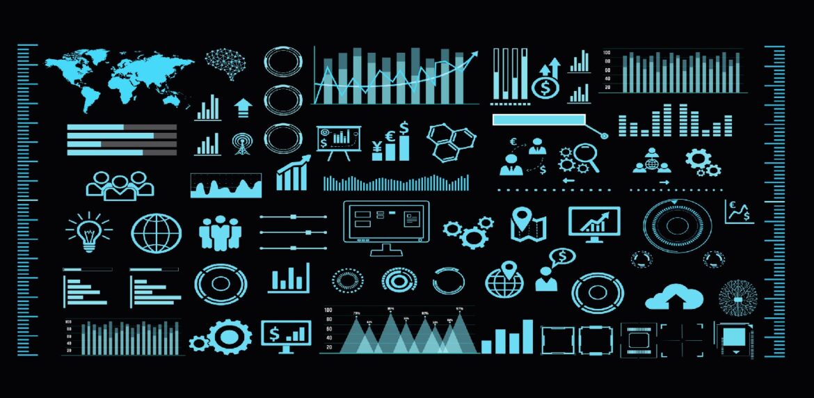
Ever hear someone say, “You gotta see it to believe it”? Well, the sentiment applies to the amazing work you may be doing as a nonprofit or business leader too. This means finding ways to present your research and, especially, your successes in creative and engaging ways. One of the most effective ways to do this is through good, accessible data visualization. Data visualization is a way to present information in a graphical or pictorial format, making it easier for your audience to understand and remember the problem you’re working to solve.
A Few Essentials
When it comes to creating data visualizations, there are some “must haves” that will ensure your visualizations are effective and accessible to everyone, including those with disabilities:
- Keep it simple: The best data visualizations are simple, clean and easy to understand. Avoid using too many colors, fonts or graphics. Doing so can make the visualization confusing and difficult to read.
- Use clear labels: Make sure that the labels on your data visualization are clear and easy to understand. Use straightforward language and avoid technical terms that may be unfamiliar to your audience. No alphabet soup, please.
- Make it accessible: Ensure that your data visualization is accessible to individuals with disabilities. This means including alt text descriptions for images, and ensuring that the colors used in the visualization are easily distinguishable for those with color blindness.
- Highlight key information: Make sure that the most important information in your visualization is highlighted and easy to see. This might mean using larger fonts, bold text, or different colors to draw attention to the most important data.
- Test it with your audience: Before you release your data visualization to the public, make an effort to test it with a representative sample of your target audience. This will help you ensure that your visualization is effective and that your audience is able to understand the information you are presenting.
Add A Little Spice…
Now, ready to go above and beyond? Here are a few ways to make your data visualizations stand out — give them a little personality:
- Use animation: Adding animation to your data visualization can make it more engaging and help your audience better understand the information you are presenting.
- Tell a story: A good data visualization should tell a story. Use the data you have to highlight the most important trends and patterns. Make it easy for your audience to draw a connection from the numbers to real people and places.
- Make them laugh: If appropriate, consider adding a bit of humor to your data visualization. This can make it more enjoyable for your audience and help them remember your organization’s approach to an issue.
Let’s Talk Tools
So, you may be wondering, “what are some of the best data visualization tools out there?”
Here are a few options to get you started:
- Tableau: is a powerful data visualization tool that allows you to create interactive dashboards and visualizations. It’s easy to use, even if you don’t have any prior experience with data visualization.
- Google Charts: is a free data visualization tool that is easy to use and provides a wide range of chart types. It’s a great option if you’re looking for a simple and accessible way to create data visualizations.
- D3.js: is a JavaScript library for creating data visualizations. It’s a powerful tool for creating complex visualizations, but it does require a certain level of technical expertise to use effectively.
- Canva: is a simple and user-friendly graphic design tool that can be used to create data visualizations. It’s a great option if you’re looking for a tool that is both accessible and easy to use.
Final Word
“If you can’t beat ’em, then join ’em!” Knowing that what you do works is different from showing how what you do works. Invest time in learning how to create effective data visualizations. Doing so can help you better connect and engage with your audience — even attract newcomers to your site. Remember, the goal is to make it easier for people to understand the work you do and the impact it has, and data visualization is just another tool in your tool belt.
Further reading and resources:
- How to Build a Dynamic Visual Brand Identity
- 5 Ways to Create Inclusive Content
- 8 Tips on How to Write Content for the Web
*We’re experimenting with AI and had it help us draft this blog post.