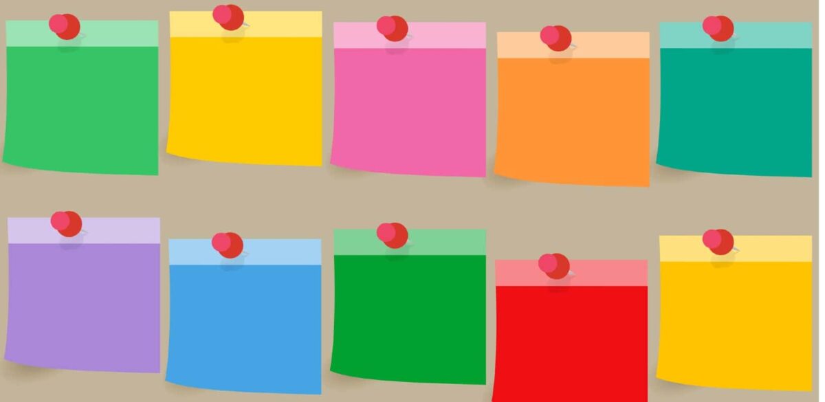
Affinity mapping looks much like a brainstorm session. Several people use post-it notes to group ideas into categories on a board, giving structure to important pieces of information. Although this resembles an informal workshop, it is actually a fundamental first step in creating impactful website design.
Affinity mapping can optimize your brainstorming session,[1] as you gather and organize ideas on the spot. It also has another important use. Affinity mapping is an efficient way to collect and organize important feedback from your website users. You can then use that information to create an optimal website design.
Why User Test?
As a non-profit, you have several audiences for your messaging. These audiences all have different interests and needs when they visit your website. Here are just a few examples:
- Donors who want to know the results of your work
- Community members who need to know how to access your services
- Volunteers and staff members who have an interest in internal opportunities
- Policymakers who may rely on your organization for background information for legislative initiatives
Your website should speak to each of these stakeholders. That’s a tall order, and one reason affinity mapping user testing is an important step before you complete your web design.
Learn how we can help you with affinity mapping and other UX processes.GET IN TOUCH
What Does Affinity Mapping Involve?
Typically, you gather information from your users about their experience with your website.[2] You can do this through surveys and focus groups on an old site or a prototype of new one.
From these surveys and focus sessions you get qualitative and quantitative feedback.[3] The second category is easier to organize. This can tell you the average time a user spent on a particular page, and the path they followed to navigate through your website. While quantitative information is helpful in the website development process, it doesn’t tell the entire story.
Qualitative feedback is a richer source of user experience data. You get less tangible, but more revealing, information. You need to analyze it before using it in your web development, in order to identify trends or patterns.
Here are a few examples of feedback you may get:
- What the user wanted to accomplish – donate, get in touch, apply for jobs, read the latest research
- What the user felt – sad, joyful, inspired, confused, frustrated, bored
- What the user suggests – more personal stories, more videos, fewer data points, shorter menus, easy access to contact information
This information typically won’t come categorized. Affinity mapping helps you take the information and create a picture[4] of what people are saying. From there, you can develop a more responsive and user-focused website.
Affinity mapping, of course, can also involve the feedback from your team — that’s where your own expert brainstorming works with what you know about your users to develop a clear path forward.
Step-By-Step Process to Get Started
So, how do you go about an affinity mapping process? You have some options. Start by identifying the source of the information. If you want to use raw data from user surveys, have that available and ready to transcribe point-by-point. Since this can be a cumbersome process because of the sheer number of data points, you can assign team members to be proxies for user ideas and follow this procedure.
- Assign a moderator – This person will keep the affinity mapping process on-track. They will organize the mapping session into concrete time chunks during which attendees will write ideas and group them together.
- Identify questions to ask – This can be broad or narrow. For example, the question may be, “How do we want people to feel when they visit our website?” “Who are our stakeholders?” “What do our stakeholders need to accomplish?”
- Write ideas – Attendees write a single idea on a “movable block,” typically a post-it note. This makes the idea tangible and easy to organize later. The idea is to generate many ideas quickly, without editing or second guessing. It will all get sorted out later.
- Group similar ideas – Organize the sticky notes such that similar ideas are grouped together. The team should come to consensus on what goes into each group.
- Name each group – Similar ideas will reveal themes for your project. Name them appropriately, using phrases such as “user objectives,” and “stakeholder frustrations.”
- Group similar groups together – See if any of the groups seem similar now, and if so, decide if you want to combine them to reduce the total number of groups.
- Review the groupings for any obvious gaps. – If something is missing the team can go ahead and add it in. This is a fluid process.
- Reflect on what you have learned – At this stage, you can analyze what your affinity map reveals. This is an excellent opportunity to compare the team’s assumptions about user experience to the reality of the feedback you receive.
At the end of the session, your team will have a visual of the information you need to develop your site.
Further reading and resources: