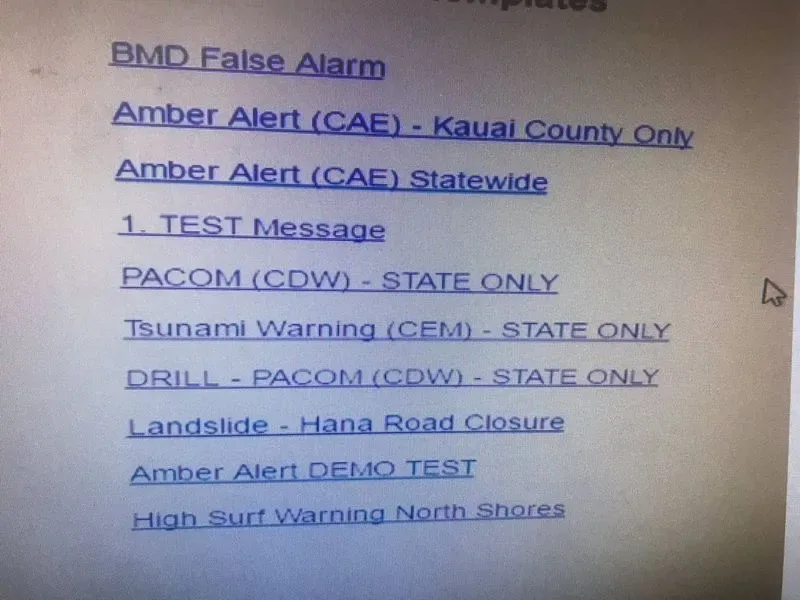
For 38 minutes on January 13th, people in Hawaii thought that a ballistic missile was incoming. The test operator selected the wrong option in the system and caused statewide panic when the ominous message appeared on everyone’s smartphones. The department had no way to automatically issue a correction on the erroneous message, which lead to the time gap between the notice and the correction. The person sending out the alert wasn’t the one truly at fault here. Instead, the failure to adhere to user interface design best practices led to this situation.

A mockup of Hawaii’s Emergency Warning System shows the problems right away. Which is the right one to click on?
The Problems With the Emergency Warning System UI
Users work with a confusing interface with poor organization and unclear labels. Anyone could have pressed the wrong line of text in this terrible design because clearly, no one considered the end user of this interface and that person’s context.
When you put together an interface design, you have to consider who will use it, the cues it offers to the user and the consequences of failure. The Hawaiian government’s lack of investment in UI design caused widespread harm to its citizens. The initial message was bad enough, but the failure to remedy the situation for nearly 40 minutes was truly traumatizing.
How to Address These UI Failures
Better content organization would make a big difference in this UI. Ideally, color coding is also available to make it clear between test and real emergency messages. One approach would use a grid with columns for the type of warning, such as tsunami, landslide or incoming missile, the location or broadcast area, and the status.
This critical system also needs an error prevention mechanism in place. Sending out this type of alert should alert the user and make it clear whether the message is going out as a test or an actual warning. In the event of a failure of the error prevention features, the user experience should have a way to quickly issue a correction to prevent widespread panic and damages.
Avoiding a Hawaiian Missile Crisis at Your Nonprofit
Problems in your UI design probably won’t have the same impact as the Hawaiian missile crisis, but you can end up with frustrated and unhappy users unable to use the system in the way that you intend. Here are a few ways to ensure that you’re on top of any UI issues before the complaints start rolling in.
Follow basic best practices for UI design like consistency, organization, and readability. Be consistent in making sure that how things look also indicates how they work (and that things that look the same, work the same.). Organize content into meaningful categories, versus the random listing in this case. Make sure people can quickly and easily understand what they are reading or looking at by using plain English, color, coding, contrast, and other tools for readability,
Have end users get hands-on with the product throughout the design and development process. You don’t want to wait until you’re finalizing the project to get this important feedback. Make sure that the UI makes sense for the way they’re going to use it, with organization that improves their experience and makes it easier.
Regularly audit your UIs to see whether they stand up to current best practices. A design that worked great five years ago may fall short of user expectations today. When you’re continually improving the UI through these audits, the design keeps getting better and you don’t have to do a massive, expensive overhaul later on.
A lot of people are placing the blame on the person who clicked the wrong alert in Hawaii, but it all comes down to the awful UI design decisions. This situation gives you a prime opportunity to bring up UI concerns with stakeholders and decision-makers in your nonprofit, allowing you to avoid imminent problems in the future.
